EXPLORING A NEW VISUAL DIRECTION FOR A FAMILIAR READING PLATFORM
A personal ux\ui redesign exploring a more contemporary visual direction for one of the most familiar platforms for book lovers. Through a refined color palette, typography, a clearer information hierarchy, and streamlined navigation, the project reinterprets the visual experience of discovering, organizing and sharing books.
SOFTWARE
Figma, Procreate, Canva
TIMELINE
2 Months
ROLE
Ux|Ui Designer, Graphic Designer, Illustrator
END DATE
October 2026
PROJECT OVERVIEW
AN APP I USE EVERY DAY WITH ROOM TO IMPROVE
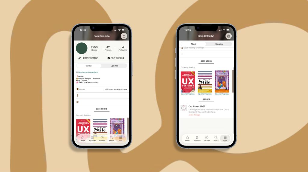
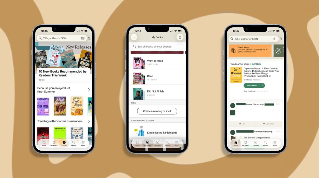
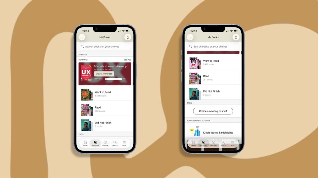
Goodreads is a useful tool for keeping track of your reading progress, discovering new books, exploring other readers’ opinions and organising your reading lists. However, having used the app regularly, I’ve noticed a few areas where the experience could be clearer, more intuitive and visually consistent.
With this project, I wanted to explore a new interpretationof the user experience, rethinking the organisation of content, navigation and the visual design of the interface.
My aim was to create a more organised and recognisable experience, capable of enhancing both the functional aspect of the platform and the personal and social aspects of reading.
RESEARCH & INSIGHTS
UNDERSTANDING READERS’ NEEDS
To better understand the limitations of the existing Goodreads experience, I combined informal conversations with readers I know with an analysis of public feedback shared by the Goodreads community on Instagram.
The aim was to identify recurring frustrations, understand readers’ expectations, and explore opportunities to improve navigation, information accessibility, and social interactions.
USER INTERVIEWS
I spoke with two Goodreads users to learn about their experiences, habits, and frustrations when using the app.
PARTICIPANT 1: L
25y, IT Teacher
The participant uses Goodreads to track reading progress and participate in annual reading challenges. However, she found some features difficult to locate, particularly incoming friend requests. She also felt that the bottom navigation contained too many options and suggested combining Search and Discover into a single destination.
She identified further opportunities to simplify book scanning and make certain interactions more intuitive.
PARTICIPANT 2: E
31y, Archeologist
The participant described the interface as outdated and explained that its visual design did not encourage her to spend more time in the app. She also found some information difficult to locate.
Her feedback reinforced the importance of a clearer visual hierarchy and a more cohesive interface.
PARTICIPANT 3: S
30y, Copywriter
The participant is an avid reader who uses Goodreads to keep track of her reading progress, discover the latest bestsellers and share reviews. She enjoys exchanging views and discovering new releases. However, she would appreciate a more intuitive app experience, with easier access to book discovery and social features such as friend requests.
COMMUNITY FEEDBACK
To complement the interviews, I reviewed comments posted by readers under Goodreads’ Instagram latest posts. These comments revealed a broader range of requests concerning navigation, social features, accessibility, and reading preferences.
READER 1:
“Add an option to search Key Words in reviews for the app”
READER 2:
“You guys could add Bookclubs“
READER 3:
“Now a Trigger Warnings feature too please. The only feature left I’m missing on goodreads…”
READER 4:
“Next can we respond to comments on the app?”
READER 5:
“Can we get the New Post option and Reply to other readers on the app not just the browser please?”
READER 6:
“Please give us an easy way to Find our Friends“
1. NAVIGATION AND DISCOVERABILITY
Readers asked for easier ways to find friends, access features, and navigate between different types of content.
2. SOCIAL INTERACTION
Requests included replying to comments, tagging other users, creating book clubs, and improving the ability to interact with other readers directly from the app.
3. INFORMATION ACCESSIBILITY AND CONTENT FILTERING
Readers expressed interest in searching within reviews, filtering their feeds, and accessing content warnings to make more informed reading choices.
4. READING PREFERENCES AND TRACKING
Other requests focused on language-specific recommendations, separate tracking for audiobooks and physical books, and more flexible reading ratings.
Importantinformation was not always easy to locate,andsomeelementscompetedforattentionwithout a clear visual hierarchy.Thiscouldmaketheexperiencefeelconfusingandrequireuserstospendmoretimefindingthecontenttheywerelookingfor.
03. OPPORTUNITIES TO SIMPLIFY THE EXPERIENCE
Navigation&interactiondesign
Someinterfaceelementsandnavigationoptionscouldbebetter organisedorcombined.Isawanopportunitytoreduceunnecessary complexity,createmorecoherentnavigationpatterns,andmakeeveryday interactions feel more intuitive.
DESIGN GOALS
1.CREATE A CLEARER, MORE COHESIVE VISUAL EXPERIENCE
Establishadistinctivevisualidentitythrougharefinedcolour palette, typography, consistent components, and improved spacing and contrast.Thedarkgreenbackgroundandwarmaccentcolourscreatearecognisableenvironment,whilewhitecardshelpseparatecontentandimprovereadability.
2. IMPROVE INFORMATION HIERARCHY
Information architecture · Content hierarchy · Readability
Restructurethehomescreenandbookpagestoestablishaclearer information hierarchy. Highlightreadingstatistics,challenges,favouritequotes,bookdetails,andreadingprogress,whileorganisingreviews,genres,andcontentwarningsintodistinct,easy-to-scan sections.
03. SIMPLIFY NAVIGATION & INTERACTIONS
Navigation design · Discoverability · User flows
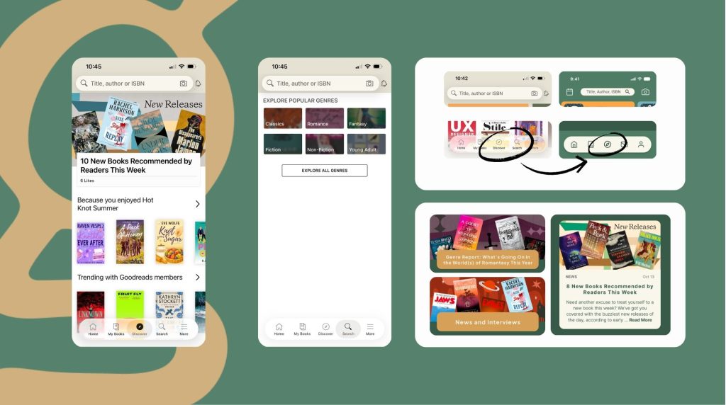
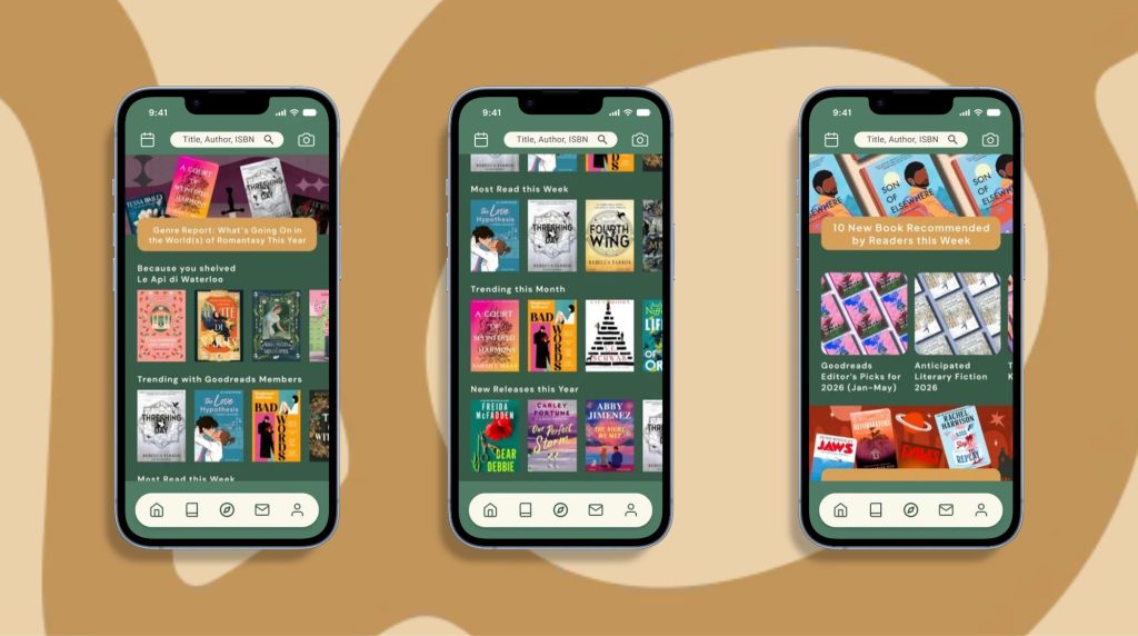
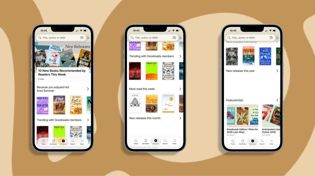
Bringbookrecommendations,trendingtitles,newreleases,community-createdlistsandeditorialcontenttogether under a single Explore destination. Simplify the bottom navigationandmakekey actions easier to identifyandaccess.
4.ENCOURAGE MORE MEANINGFUL READING INTERACTIONS
Social interaction · Community · Content transparency
Makereadingupdates more engagingthroughclearerpostlayouts,visiblesocialinteractions,booktags,andcontentwarnings.Introducedirectmessagingandmoreaccessiblereviewfilterstohelpreaderssharetheirexperiencesanddiscoverperspectivesfromfriends,followedusers,andthewidercommunity.
A NOTE ON THE DESIGN CONTEXT
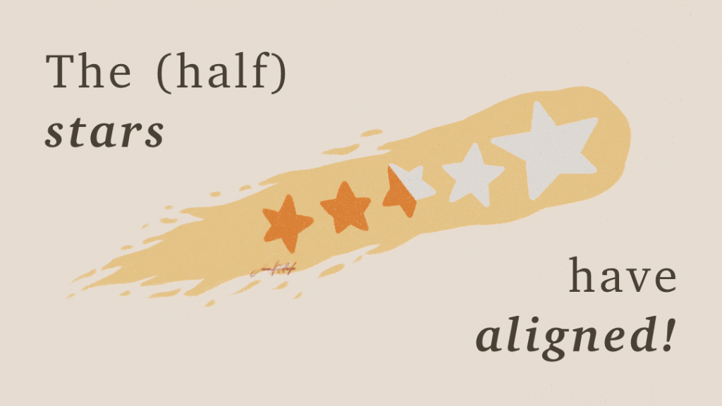
This project began before Goodreads introduced its dark mode and half stars. My redesign explored a different visual direction, with a colour-led interface and a stronger focus on visual hierarchy, readability, and consistency.
SOLUTIONS
A NEW DIRECTION
One of the main focuses of the project was to reorganise the information so that each section of the app had a clearer purpose. I worked on the navigation, the content hierarchy and the relationship between the different sections, aiming to reduce the fragmentation of information and make it easier to understand the available features at a glance.
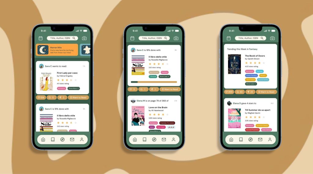
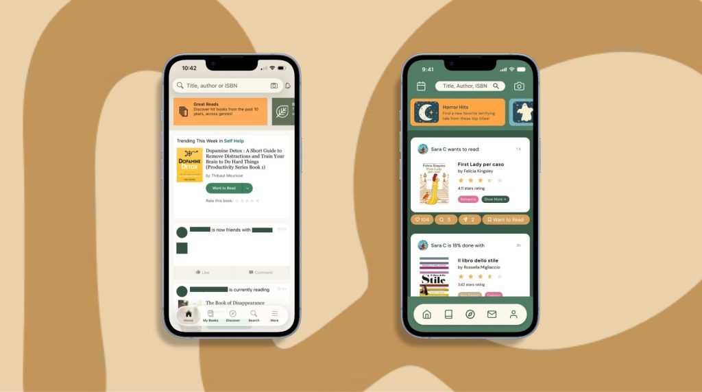
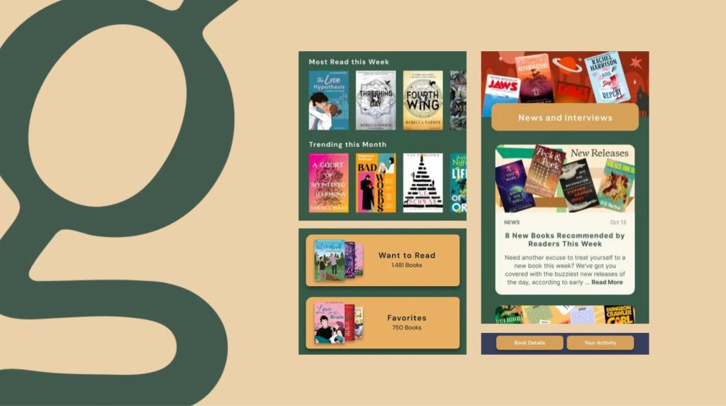
Home
-The search bar has been moved to the centre, allowing two icons to be placed either side: the camera icon, which lets you scan book covers and QR codes, and the calendar icon, which I added to enable users to have all literary releases and related events (such as book fairs, films and much more) at their fingertips.
-The news items always remain at the top, but the information is centred and flanked by illustrations that are more in keeping with the illustrated style already adopted by Goodreads, particularly on social media.
-The posts are more visible; they stand out against the background and display useful information for the reader, such as the title, author, star ratings and, finally, the tags, which I’ve divided into genres and trigger warnings. Below, I’ve added clearly highlighted buttons for likes, comments, shares and ‘Want to Read’, focusing on the community and sharing aspect that does exist on the app, but which I think is very limited.
-The navigation bar has been simplified: I’ve removed the text labels, merged the Search and Discover pages, and replaced ‘More’ with the reader’s profile.
Reading Updates
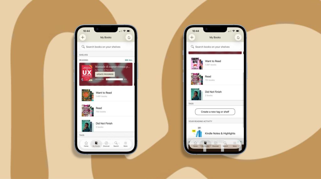
-Improvements to the visual appearance and layout of the information.
-Addition of ‘News & Interviews’. There were already a few scattered articles in the ‘Discover’ section, so I thought it was necessary to create a section to bring them all together. This way, all the articles are easy to find and, as a result, you can discover new titles through them.
-The page looks tidier. The books suggested are in line both with the individual reader’s favourite reads and with the latest releases.
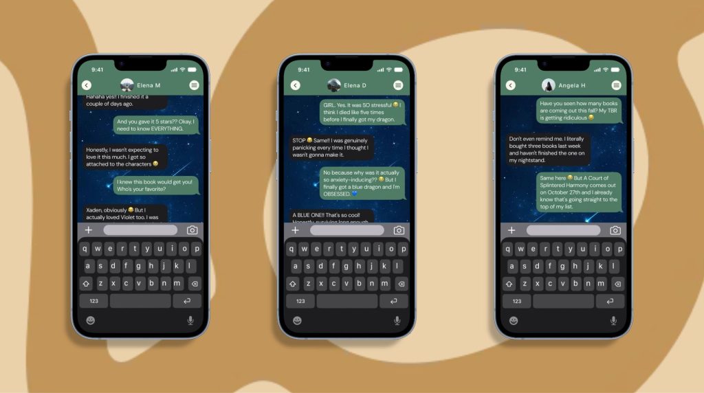
Messages & Chat
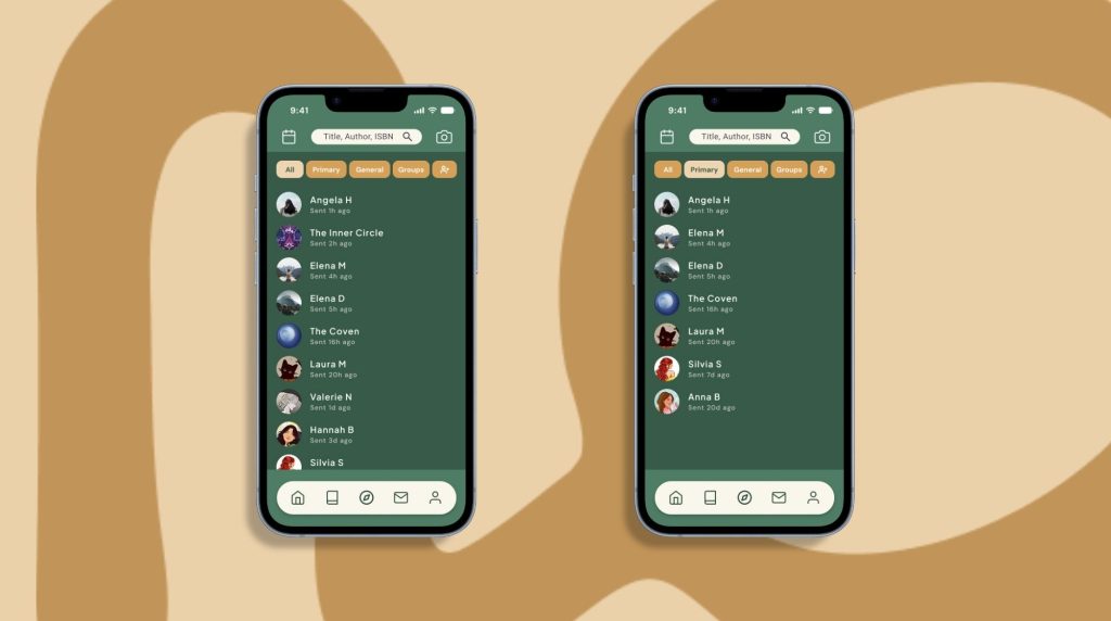
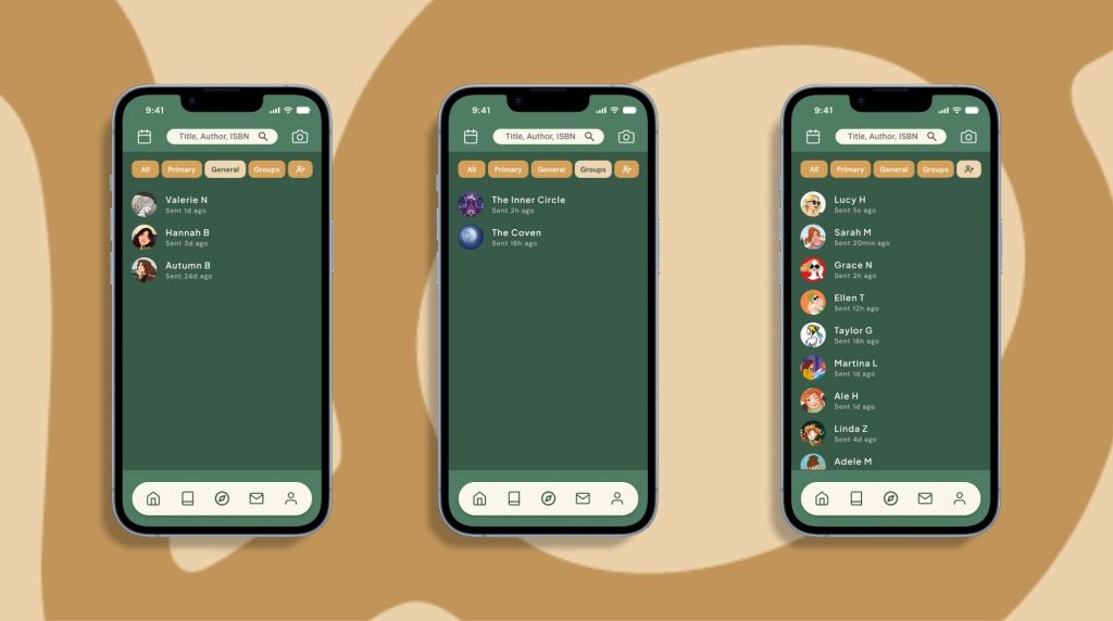
-Added a messages section, divided into Primary, General, Groups and Friend Requests.
-I have included friend requests in this section because users have found it difficult to locate them within the app.
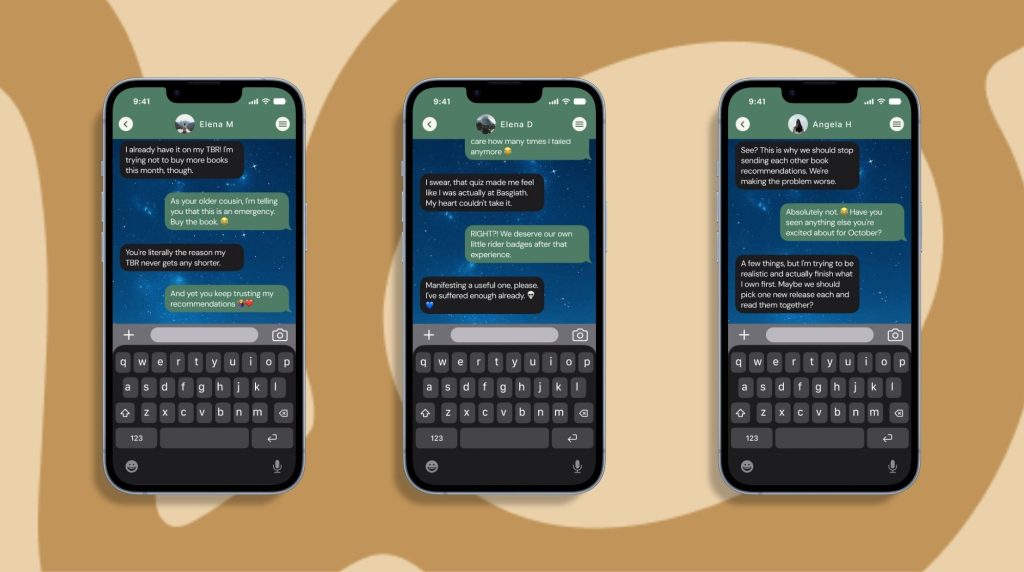
-This section aims to further encourage interaction between readers within the app, and to facilitate the creation of groups and spaces where users can interact with one another, make new friends and exchange views.
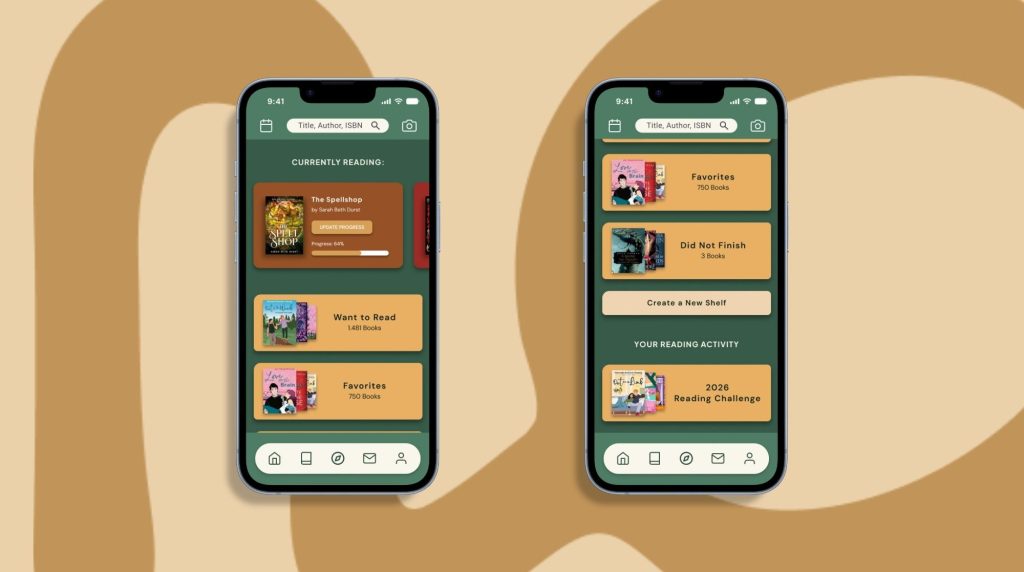
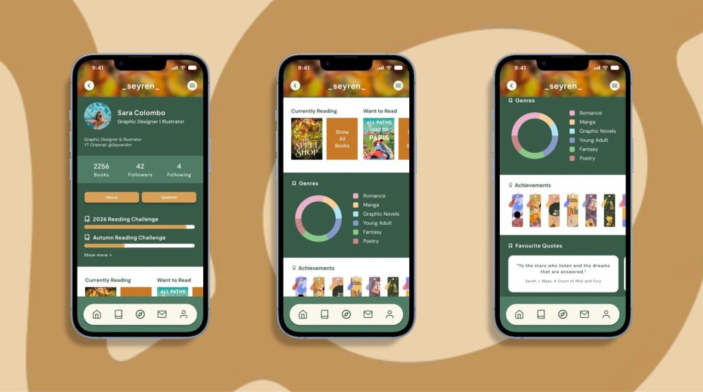
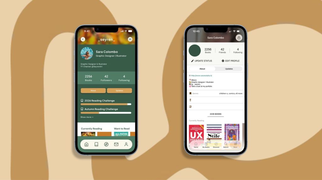
Profile
-Improved layout of spaces and information.
-Reading Challenges highlighted.
-Inclusion of a chart showing the genres of books read.
-Addition of highlighted Achievements. These are present in the app, but seem to be hidden. This gives meaning to their existence and value in achieving them.
-Inclusion of Favourite Quotes. These feature heavily in the desktop version but are almost non-existent in the mobile version. This adds a further level of personalisation to the reader’s profile.
-Customisation options for colours, profile picture, background (at the top), achievements and quotes on display.
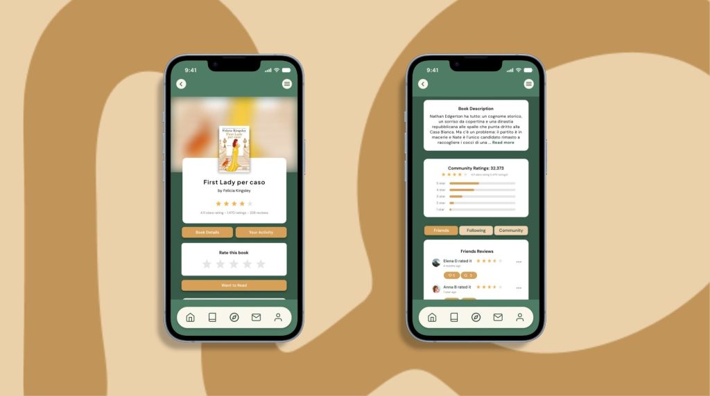
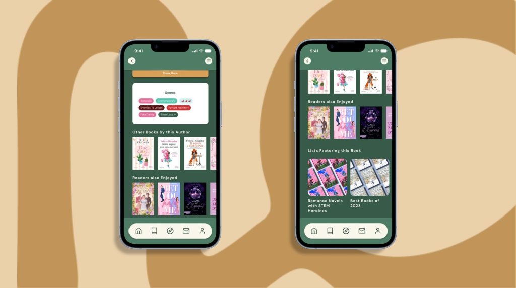
Individual Book Details
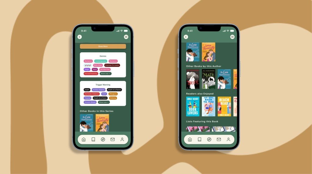
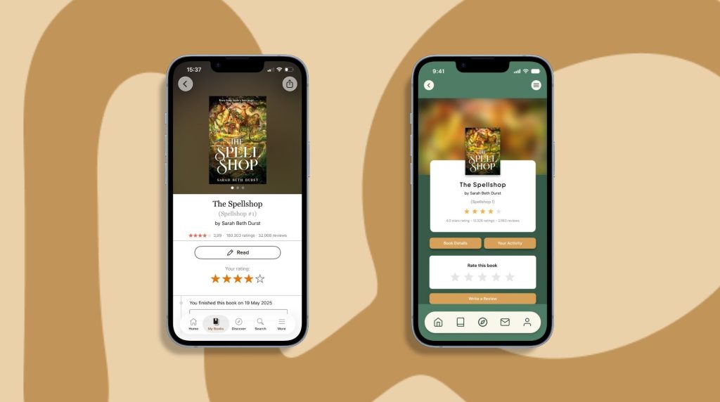
-Improved layout of information and contrasting colours that further highlight the different sections within the space.
-Addition of the ‘Book Details’ button, to find all the information in one place, and the ‘Your Activity’ button, which could potentially meet the needs of different readers (I’m referring to the distinction between physical books and audiobooks, the book’s language, etc.) should the app be further developed.
-Clearly highlighted ‘Rate this book’ and ‘Write a review’ banners.
-The ‘Community ratings’ banner has been further divided into reviews from ‘Friends’, ‘Following’ and ‘Community’, which are now clearly separated into three buttons and can be selected as required. In the app, this section used to be particularly chaotic.
-‘Likes’ and ‘Comments’ are more prominently displayed beneath the reviews, to encourage their use.
-Addition of tags divided into ‘Genres’ and ‘Trigger warnings’, which I find particularly important.
HOME
Before and After
PROFILE
Before and After
DISCOVER
Before and After
READING UPDATES
Before and After
MESSAGES
New Additions
INDIVIDUAL BOOKS DETAILS
Before and After
VISUAL DIRECTION
REFINED VISUAL IDENTITY THROUGH COLOR, TYPOGRAPHY AND STRUCTURE
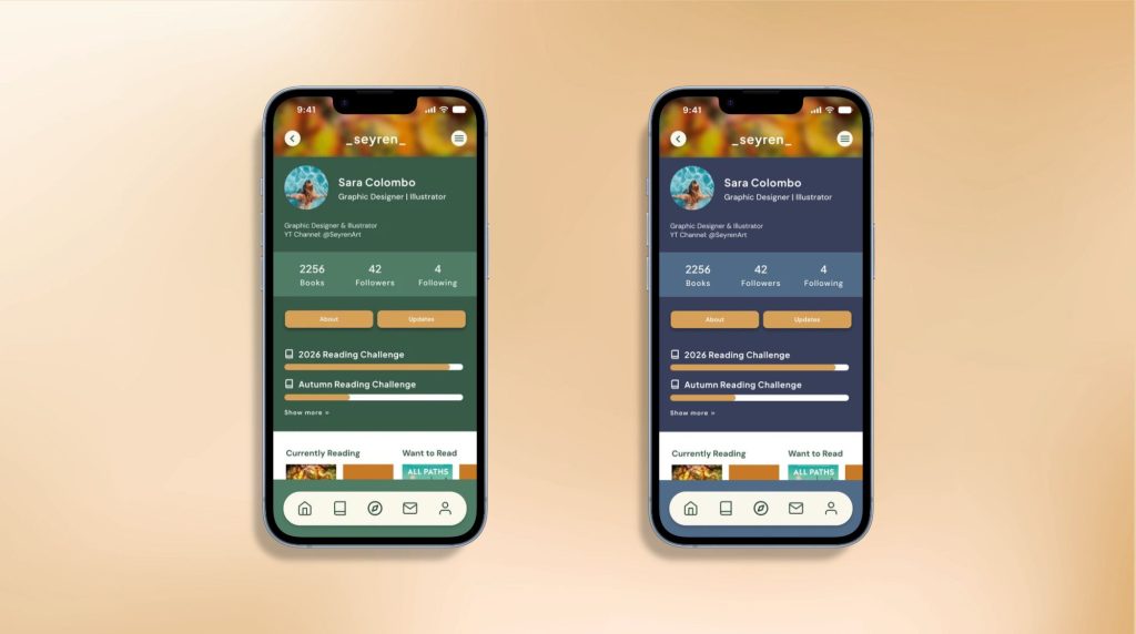
The redesign introduces a more contemporary visual direction through a restrained palette of dark tones, muted ochre accents, and soft whites. These choices are paired with a clearer information hierarchy and a more streamlined navigation structure, creating a cohesive interface that feels modern while remaining familiar.
A PALETTE DESIGNED TO EVOLVE
The selected palette establishes the visual foundation of the redesign, combining dark tones, muted ochre accents, and soft whites to create a more contemporary aesthetic. Rather than being a fixed solution, it serves as a starting point for a more flexible visual system, with the potential to introduce additional color themes and allow readers to personalize their space according to their preferences.
USER FLOW
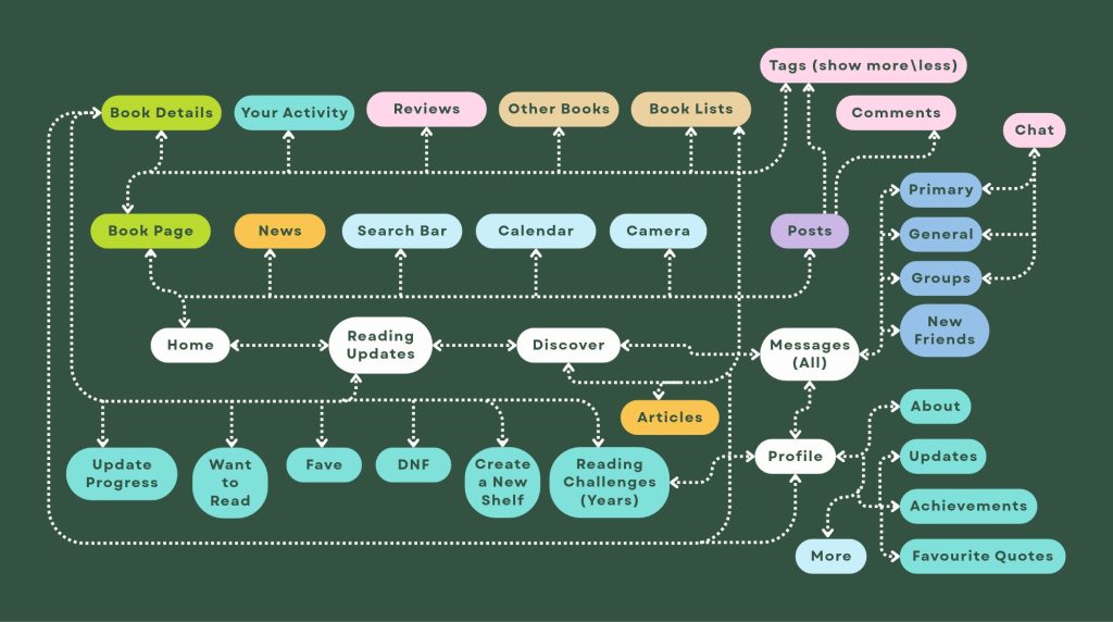
Building on Goodreads’ existing structure, I refined the user flow to create a more intuitive and accessible navigation experience.
The redesign preserves the platform’s familiar foundation while introducing targeted improvements, including a unified Search & Discover section, a dedicated space for chats and friend requests, and a literary events calendar on the Home screen.
These changes aim to make it easier to find key features, simplify navigation and encourage users to explore booksand connect with other readers more seamlessly.
REFLECTION & NEXT STEPS
THE PROJECT’S POTENTIAL FOR FURTHER DEVELOPMENT
This redesign has allowed me to explore how well-considered improvements to the user interface can modernise and enhance an existing platform, breathing new life into it whilst keeping its visual identity in line with social media platforms such as Instagram.
By refining the navigation, making key features more accessible to users and introducing new elements – such as a calendar of literary events – I sought to create a more intuitive and engaging experience for the reading community. The introduction of chat features and the visual enhancement of elements such as comments, reviews and shares are designed to encourage greater interaction and sharing amongst users.
This project has reaffirmed the importance of understanding existing users’ journeys, identifying areas for improvement and making design decisions that strike a balance between familiarity and usability.
BUT THERE IS STILL HUGE SCOPE FOR IMPROVEMENT:
-I would like the user to be able to choose the app’s base colours, thereby increasing the level of customisation. This was also a request made to me by a user whilst testing the final prototype.
-I would include a calendar page in the final project, which could list all the key dates in the literary world, such as book releases, film adaptations, book fairs, etc. (For the moment, there’s only the icon, but it’s something I really wanted)
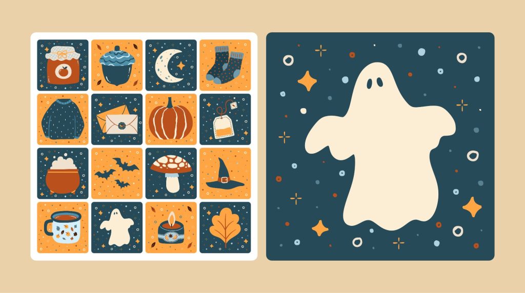
-Having kept several bullet journals over the years, as you’ll see from the section on my website, I know there are various elements that are included and used in reading journals, such as Bingo grids. I’ve illustrated an autumn-themed one, as I thought the idea was really lovely and a bit different from the standard reading challenges found in apps. Perhaps completing it could earn you an illustrated badge.
-When updating reading details, I would introduce specific selectable options such as the language in which the book was read, whether it was in print, as an audiobook, etc. There are users who are keen to read the same book in different languages, and I think this would be a very interesting addition.
-It would be interesting to include a section on the reader’s personal profile featuring books they recommend. I think this would really highlight their personal identity, and the same goes for favourite quotes and the app’s customisable colours.
A FURTHER THOUGHT:
There are alternatives to Goodreads that are far more sophisticated and up to date (I’ve discovered this whilst doing my research), but I’ve asked myself: is it really necessary? Do users really want to clutter up the screen of their phone even further? I myself, like other users I’ve spoken to, don’t want an app full of unnecessary distractions that feels overwhelming. I want an app that’s functional, visually appealing and customisable.
For these reasons too, I think Goodreads’ strength lies in its simplicity.
A functional simplicity that simply needs to be improved.